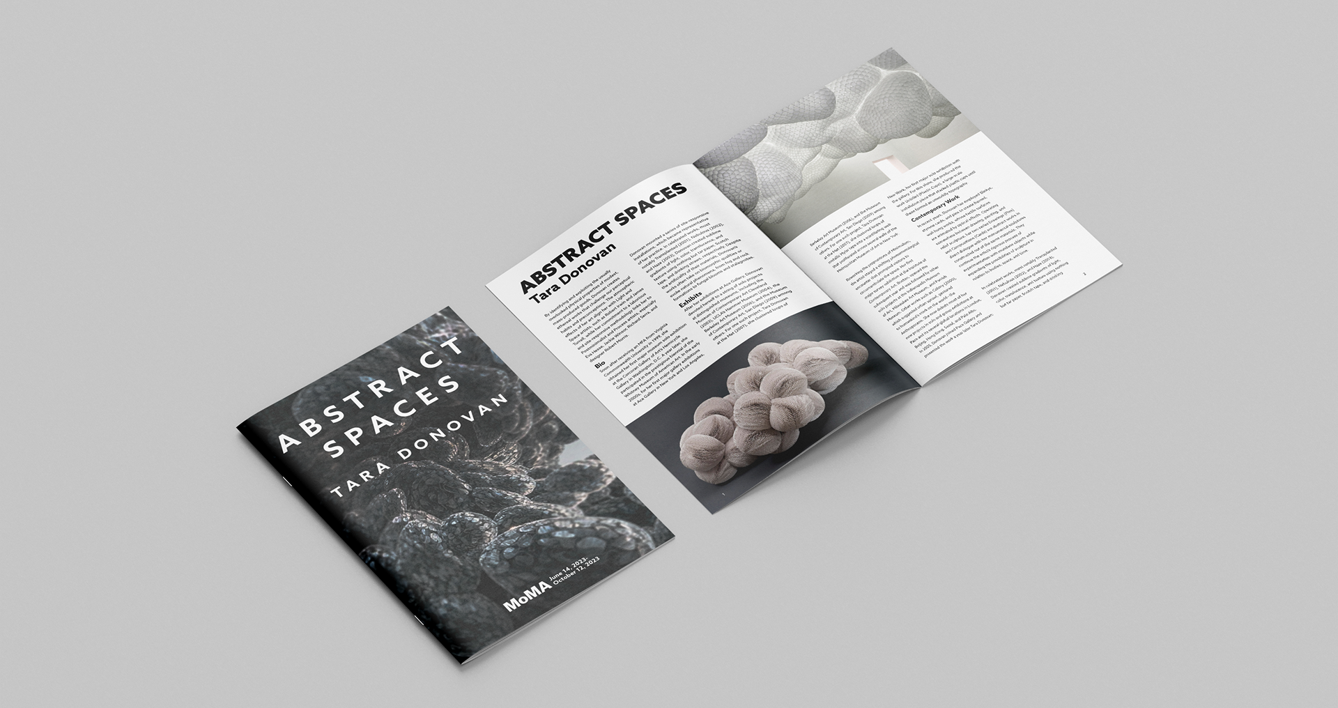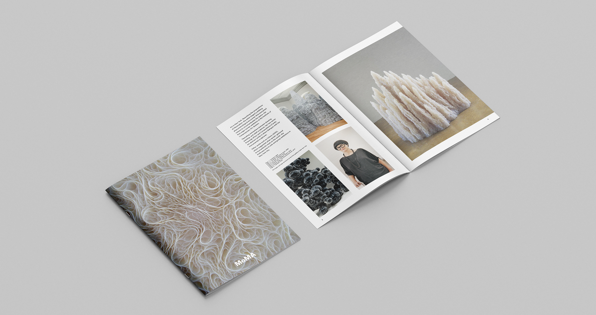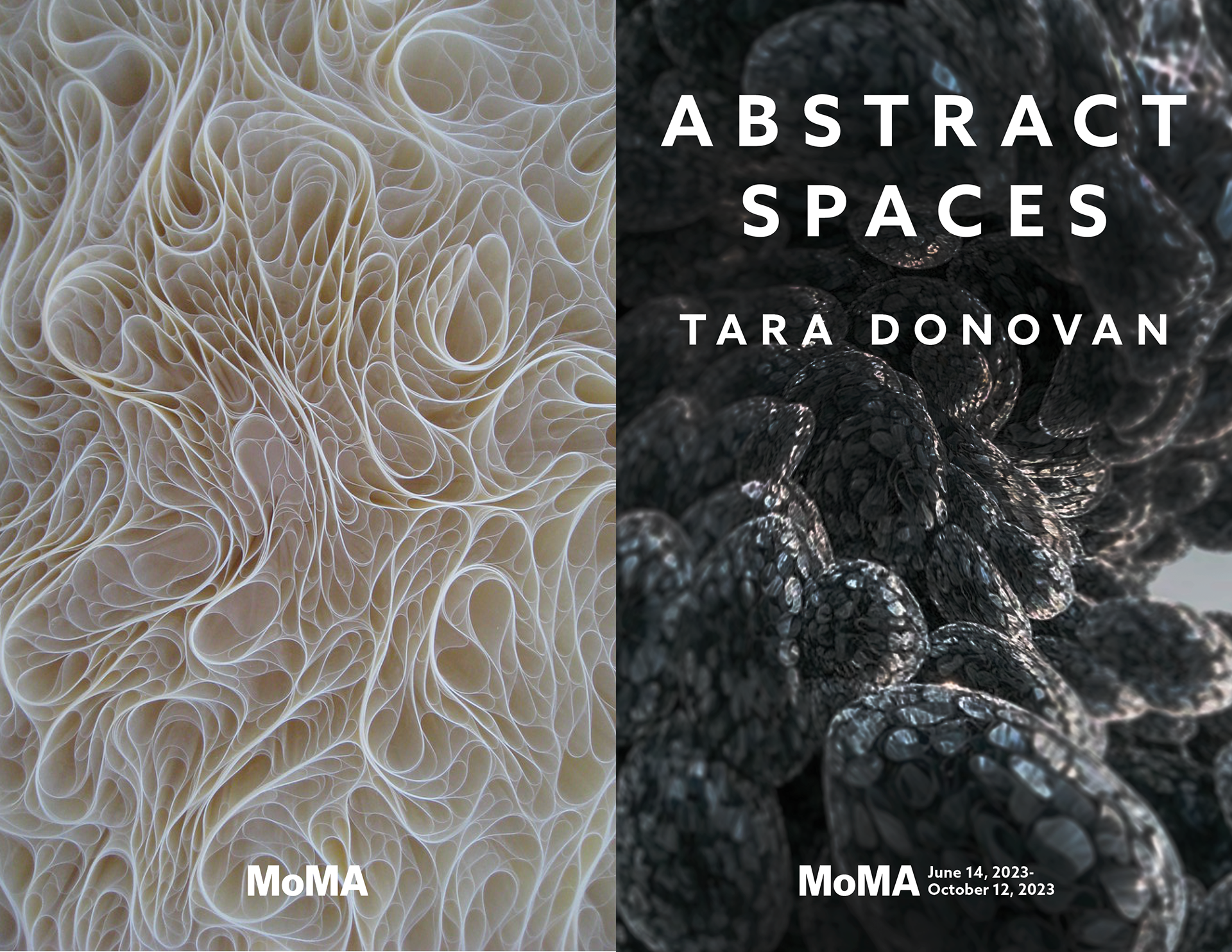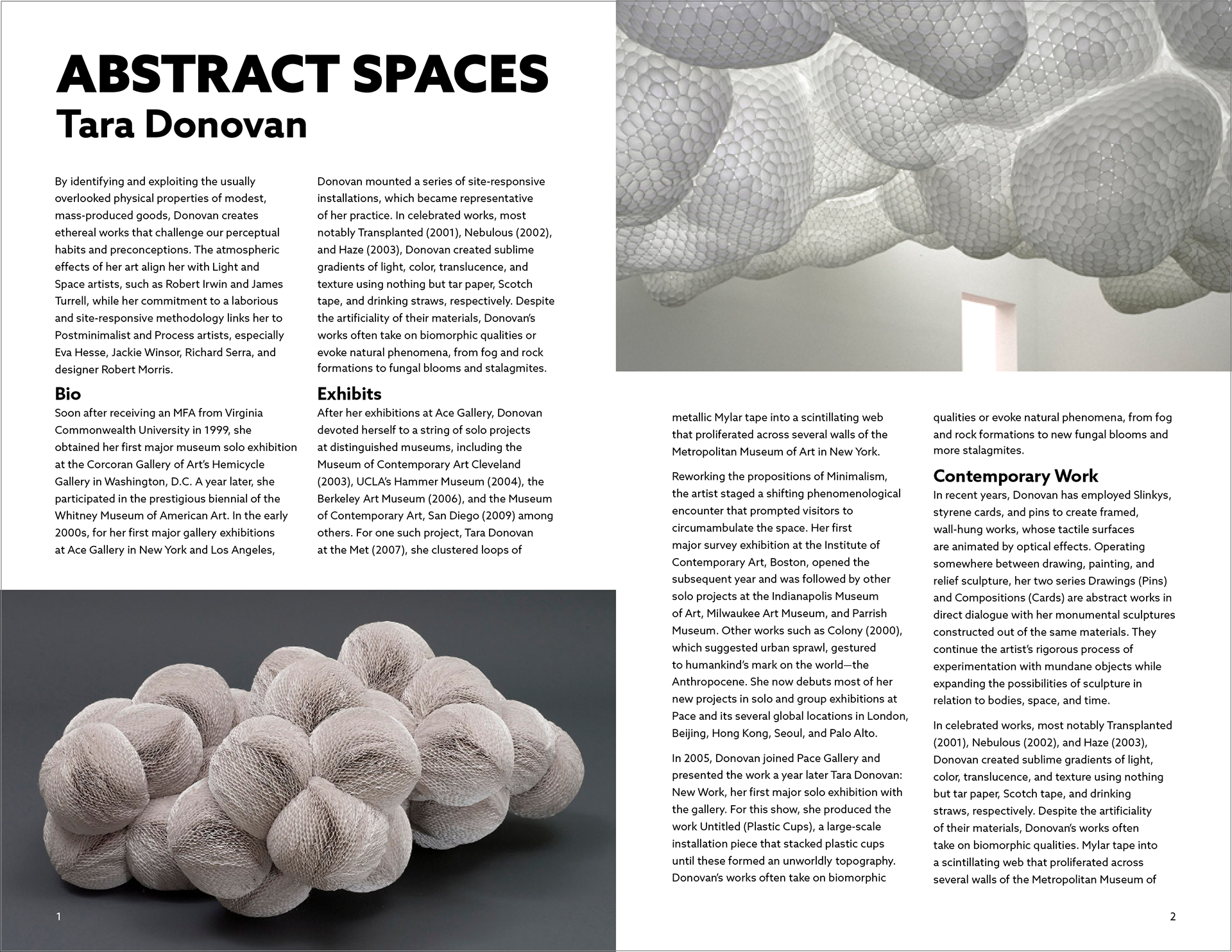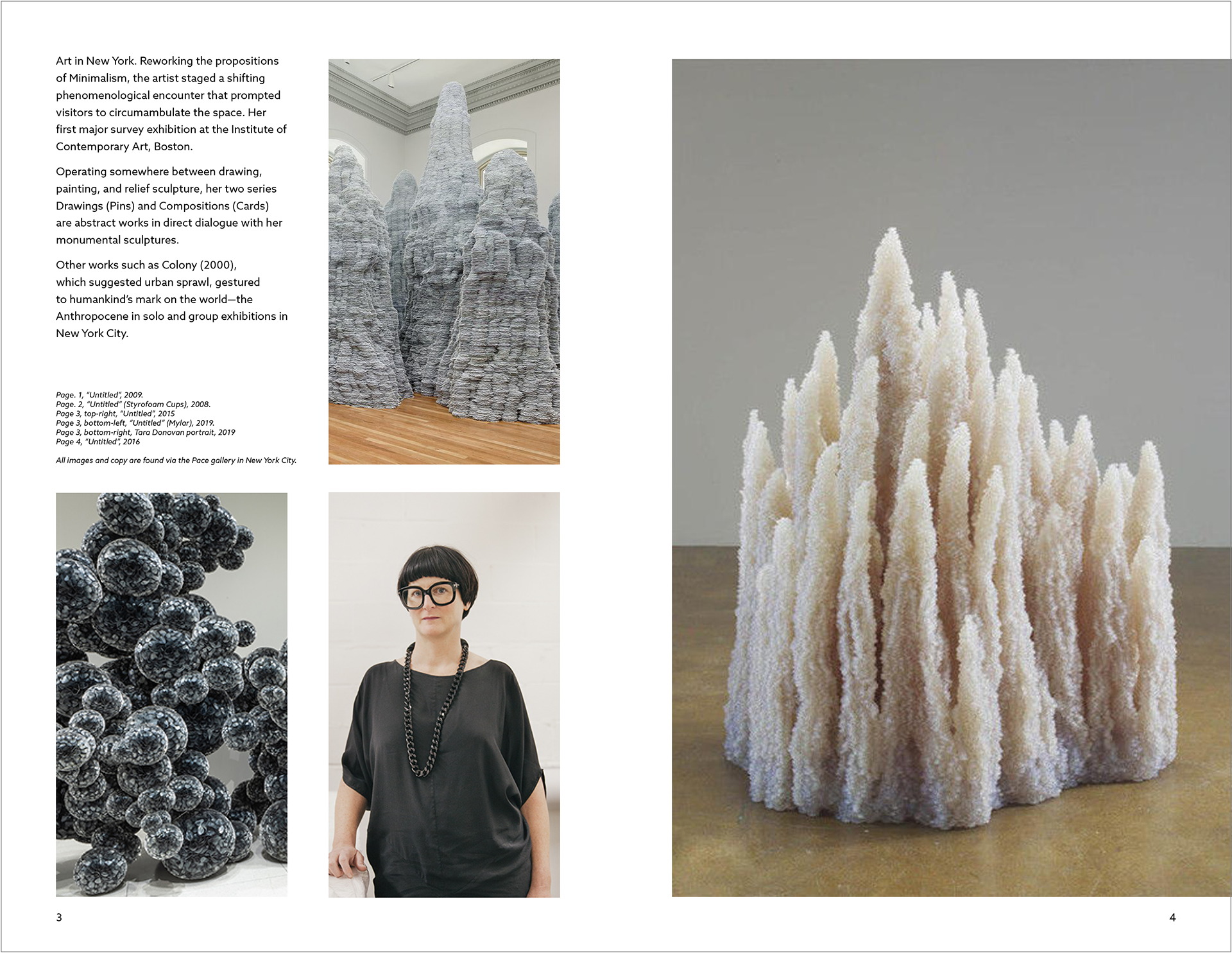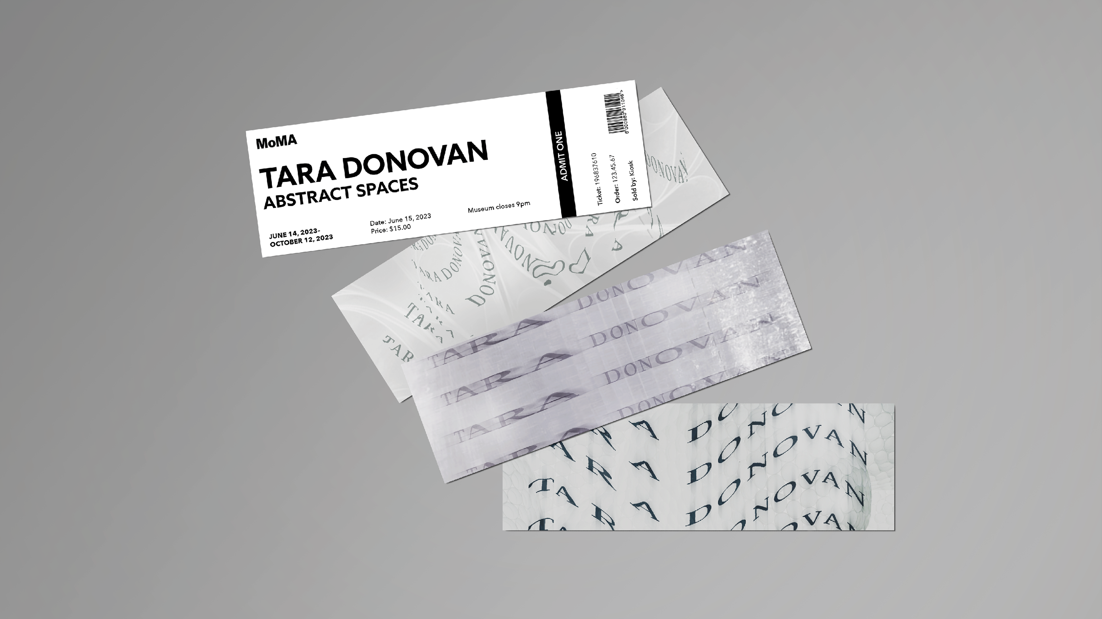
This project was to build off of the original set of three posters I made in a previous class. For context, the previous project was to create a set of three posters based off of a chosen artist. The typography, composition, etc. was to connect to the nature of the artist’s work. The artist I chose was Tara Donovan, a 3D installation artist who often uses common found and recyclable objects, such as plastics, glass, and paper.
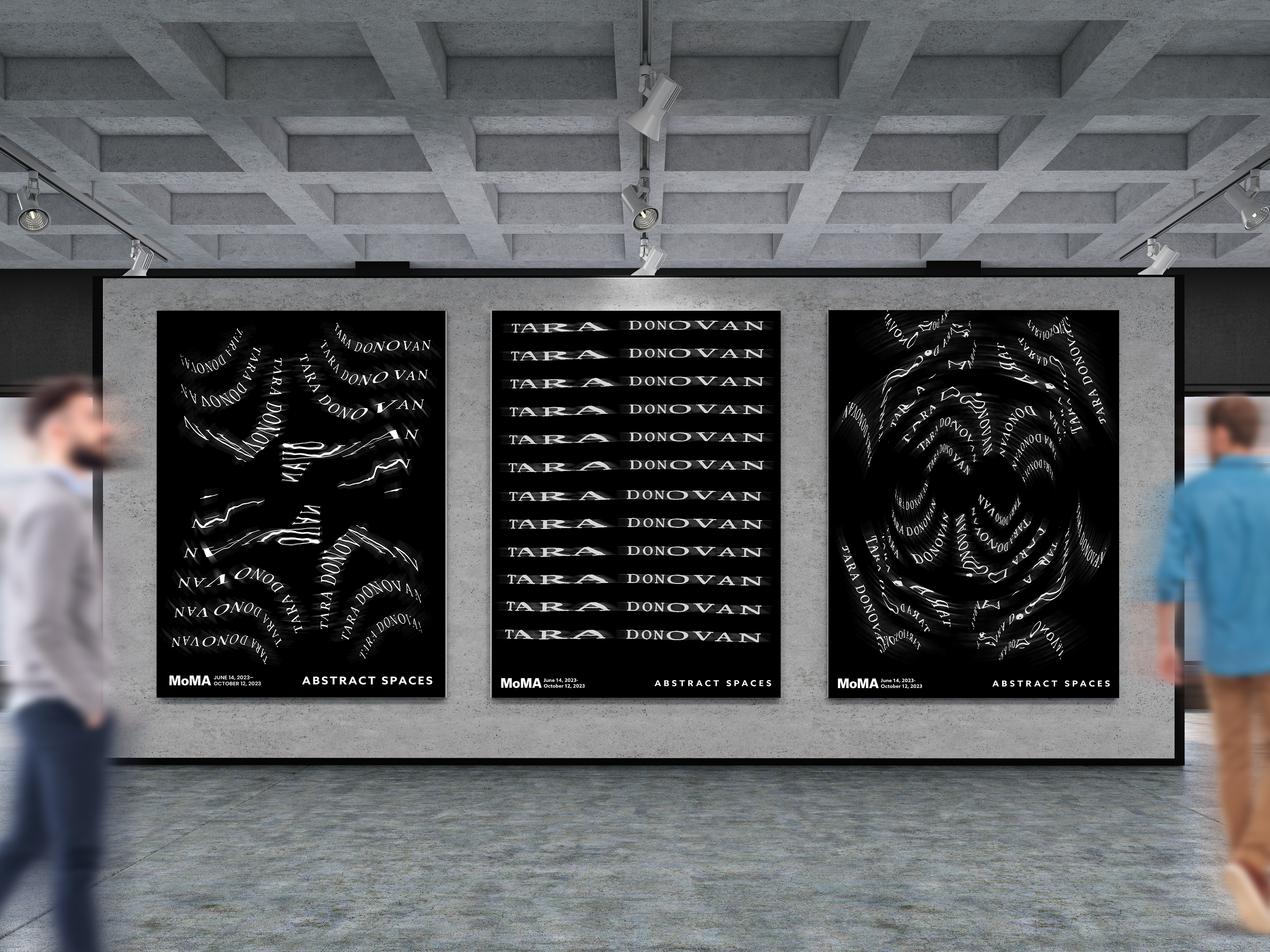
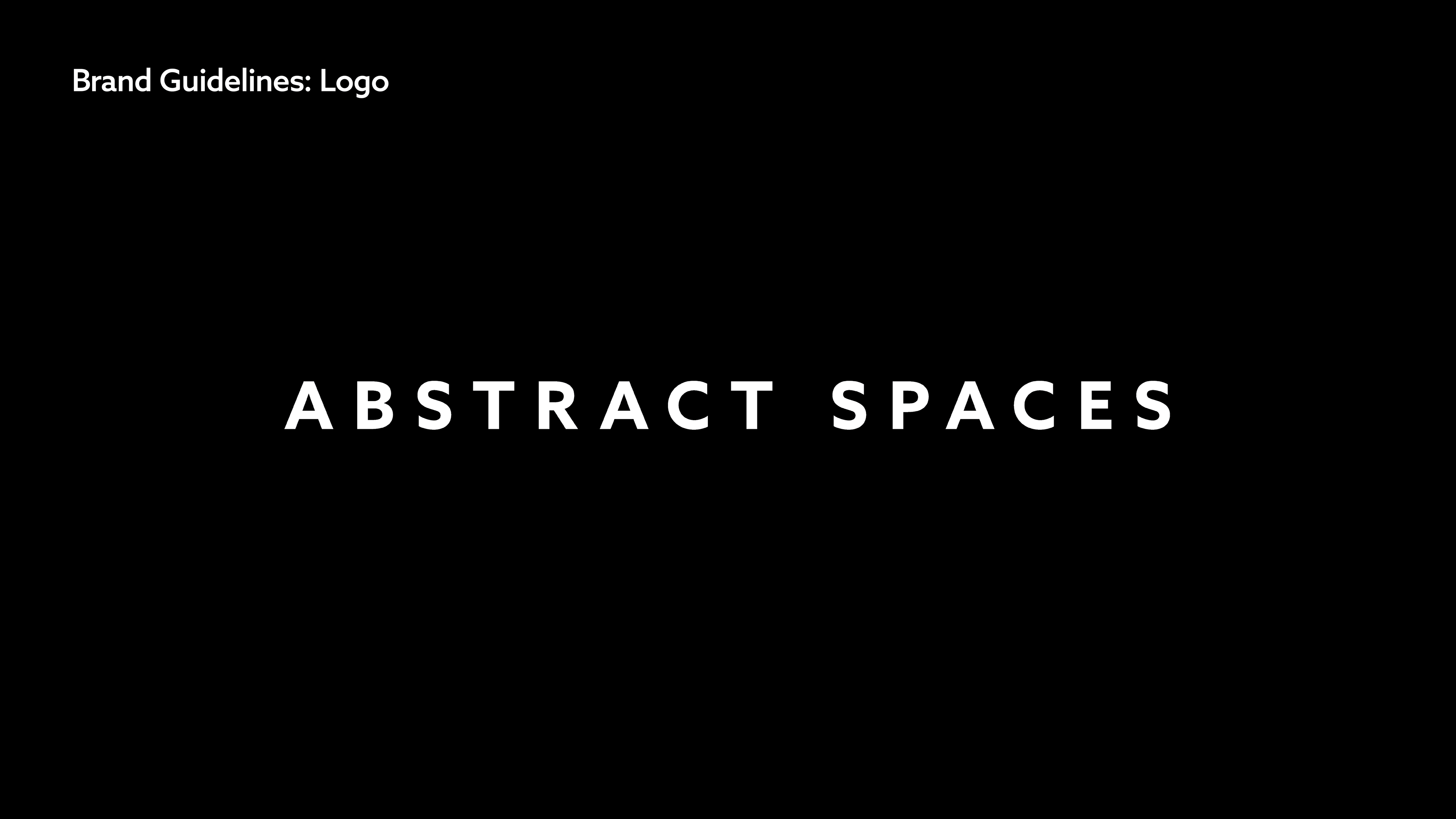
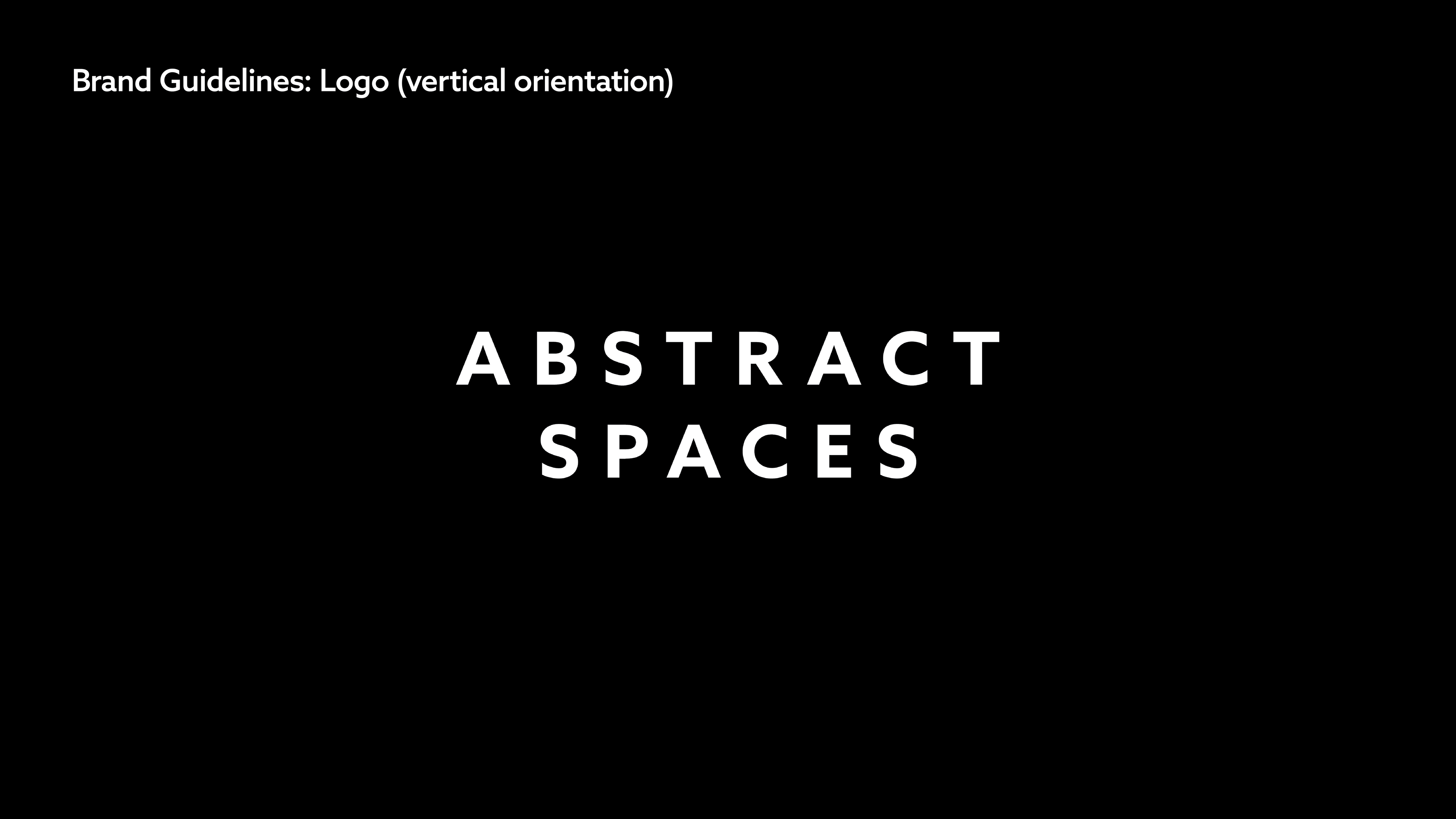
Her work evoques many forms, but what can often be found is a sense of movement, aggregation, unity, and progression. The posters and supporting elements were designed to emulate this. The typography is distorted in a way that reflects the same sense of her movement that her work has. In terms of the catalogs and tickets, it was intentional that the typography faded into the background; no special attention given to it that allows it to be easily read while having most of the focus be on pictures of her work.