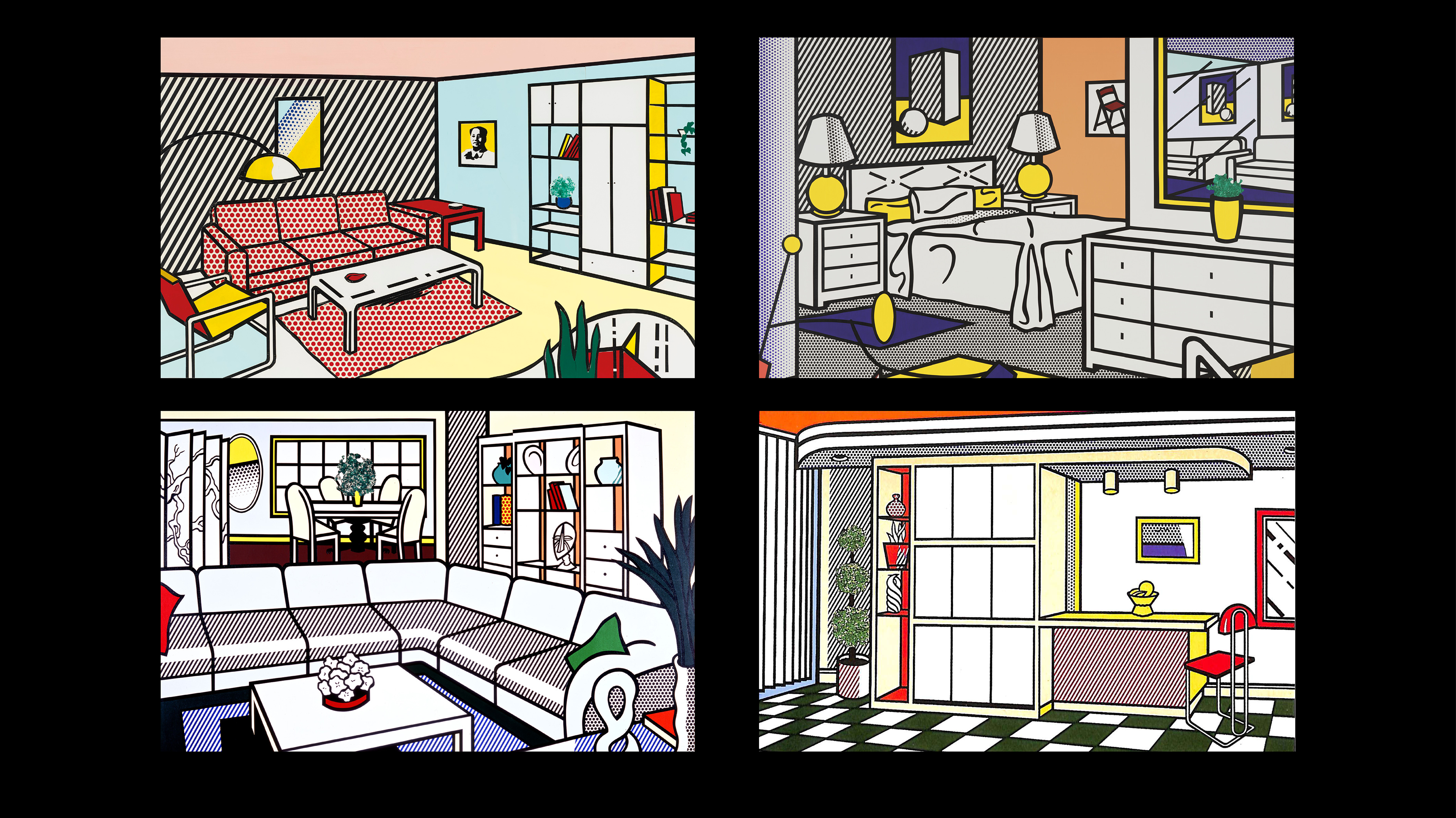
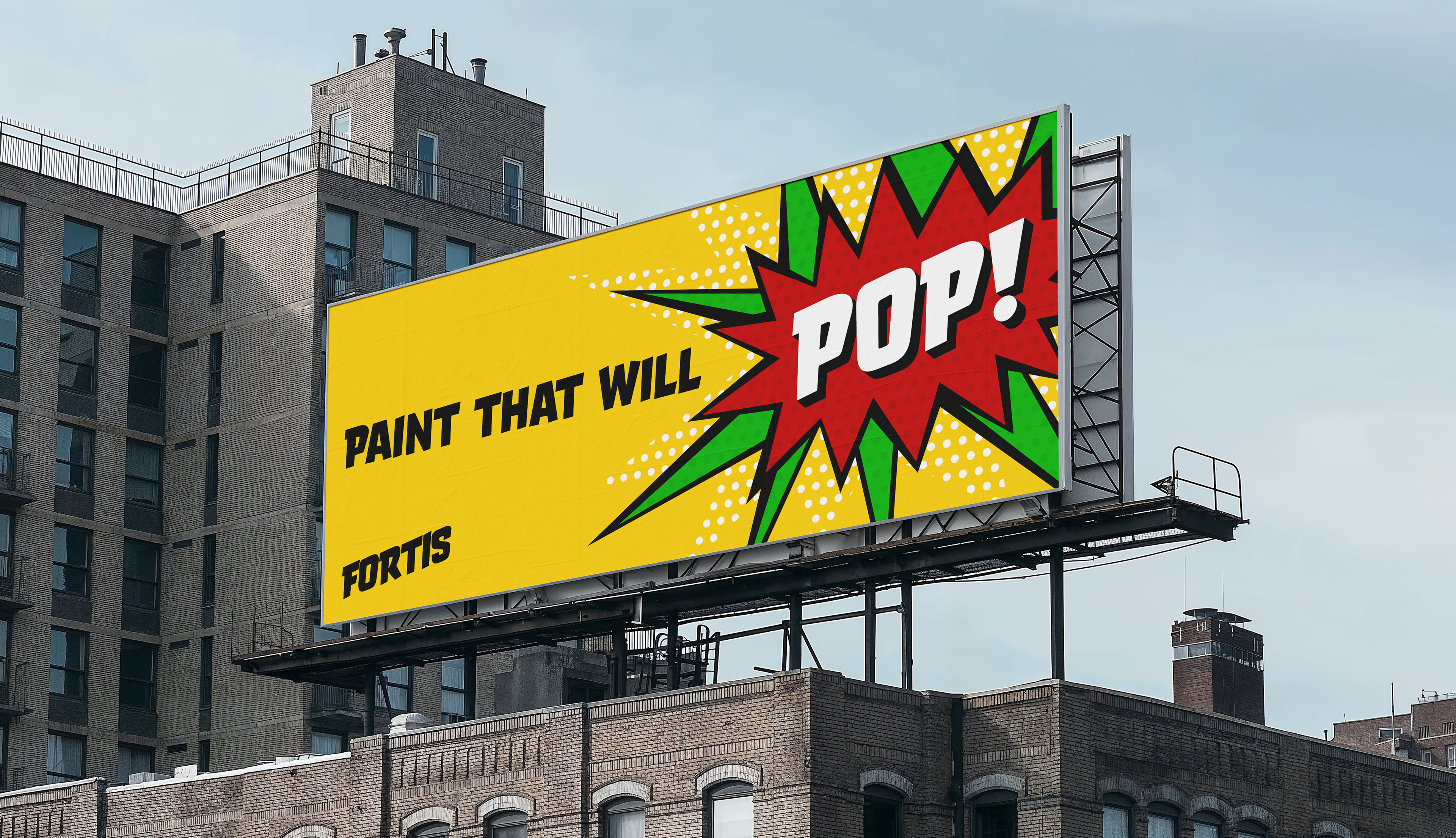
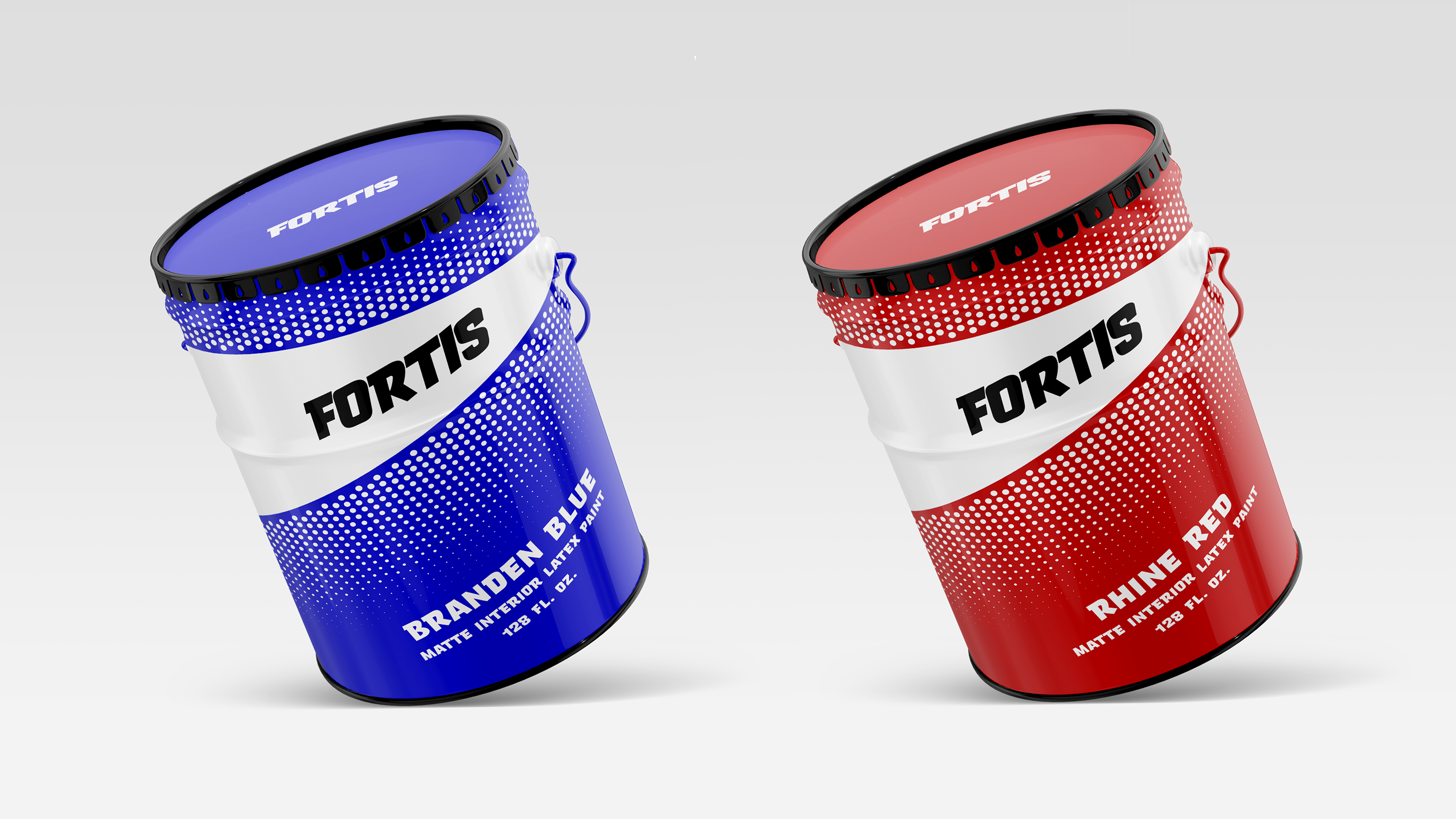
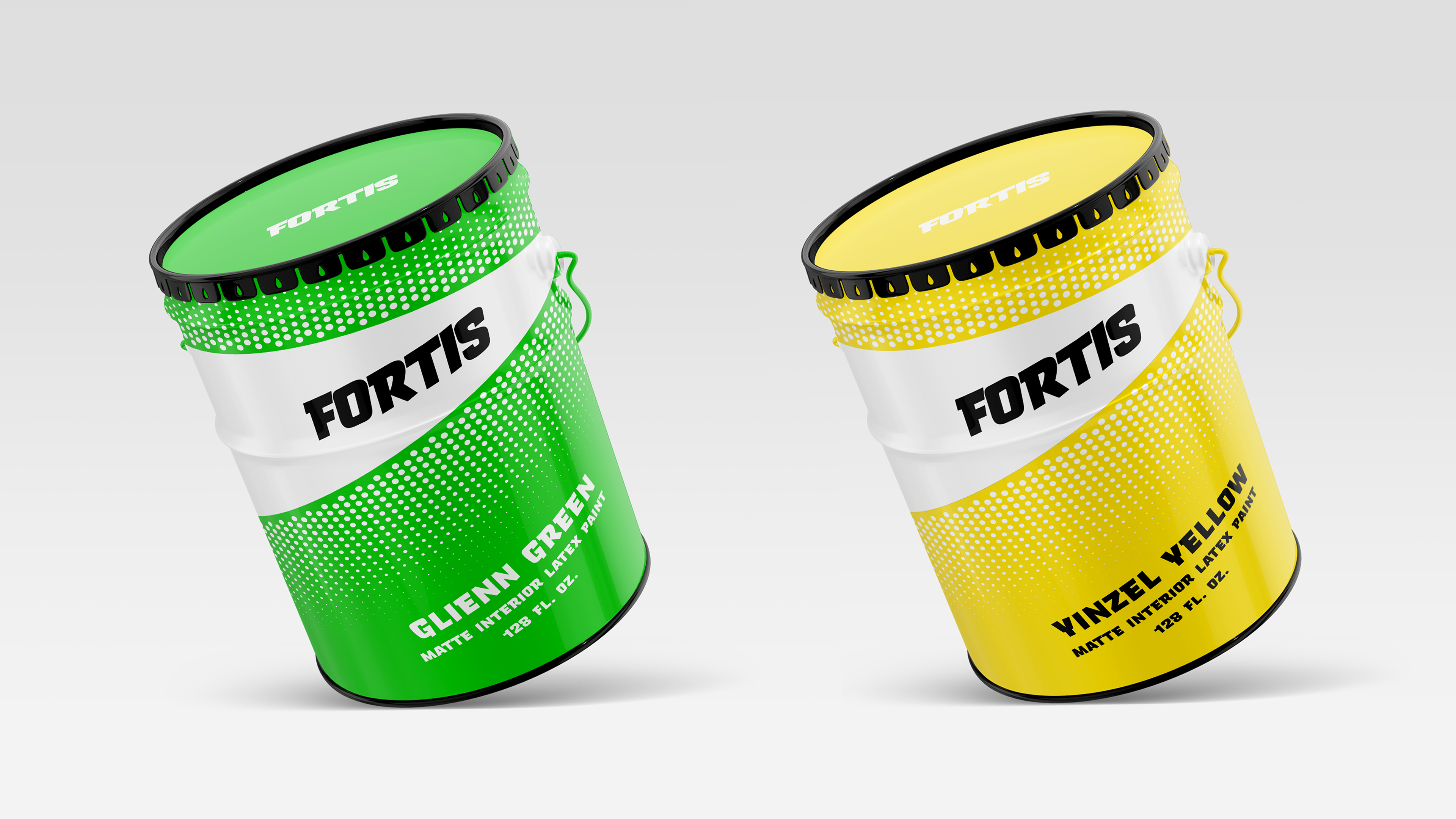
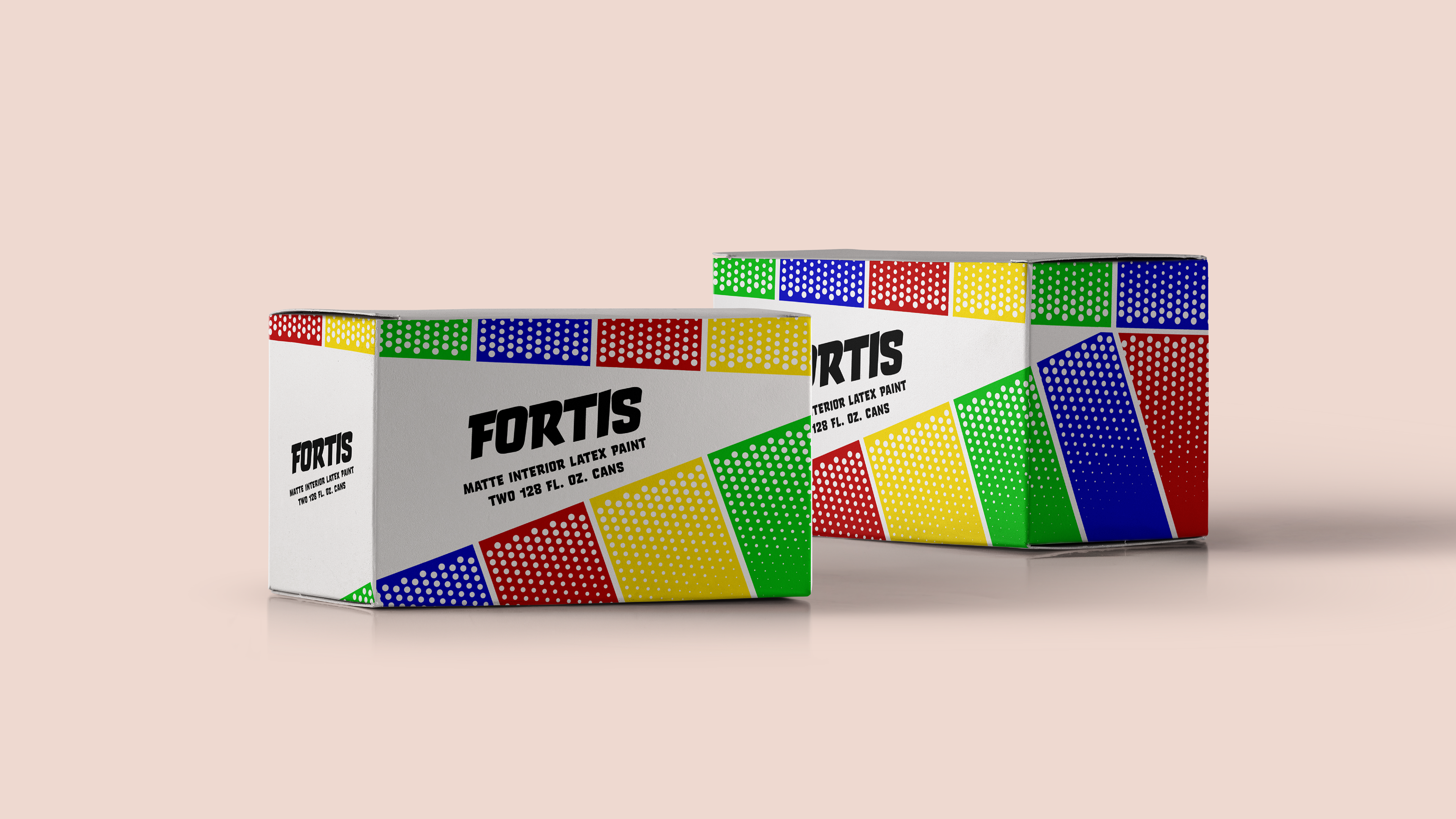
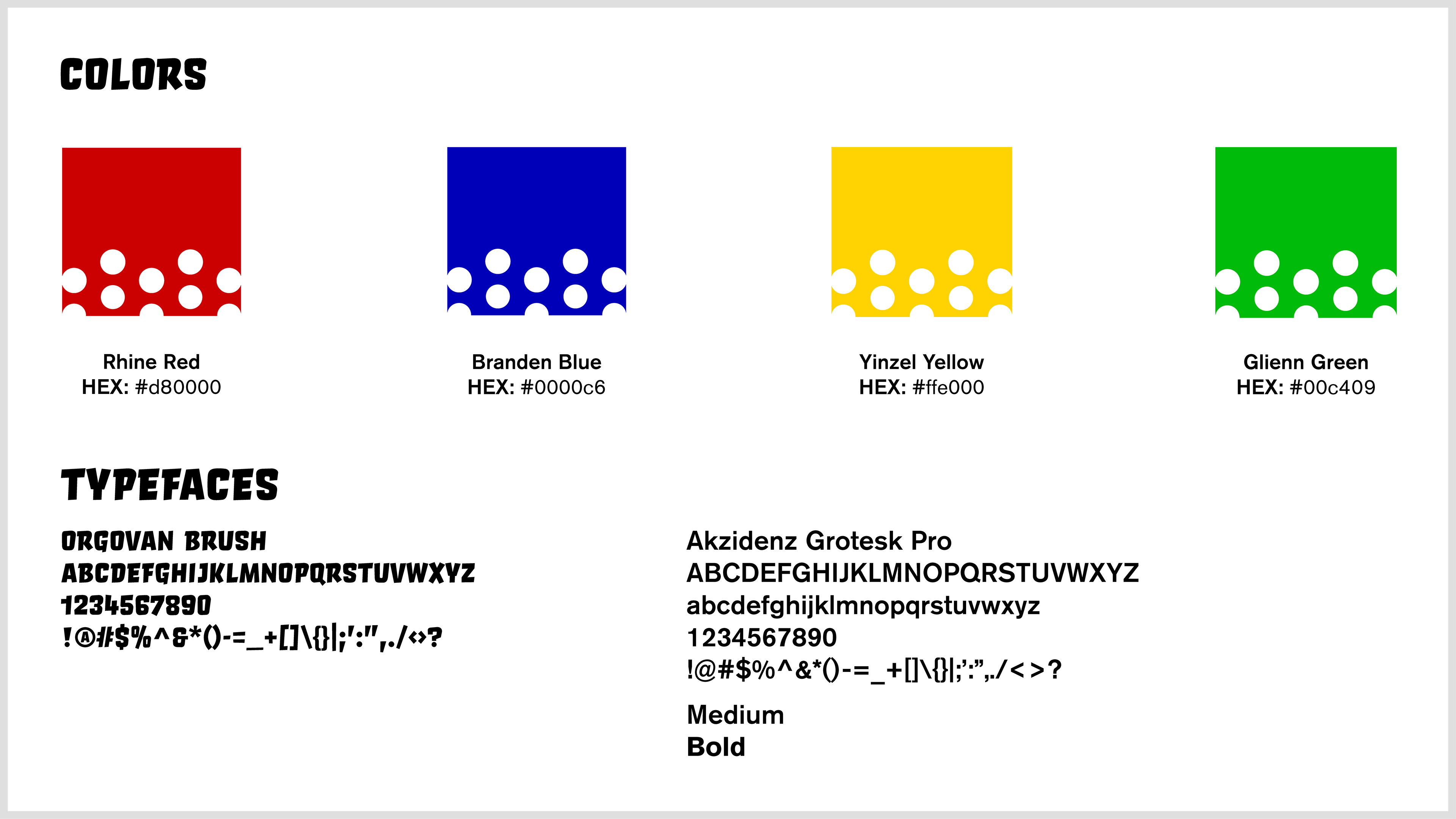
Fortis is a paint brand inspired by the interior paintings of Roy Lichtenstein. His style is that of both pop art and comic books. I incorporated his work into the design in a few ways. For one, using the halftone pattern. The circles that gradually get smaller is a pattern that was common to find throughout his work.
Logo & Brand
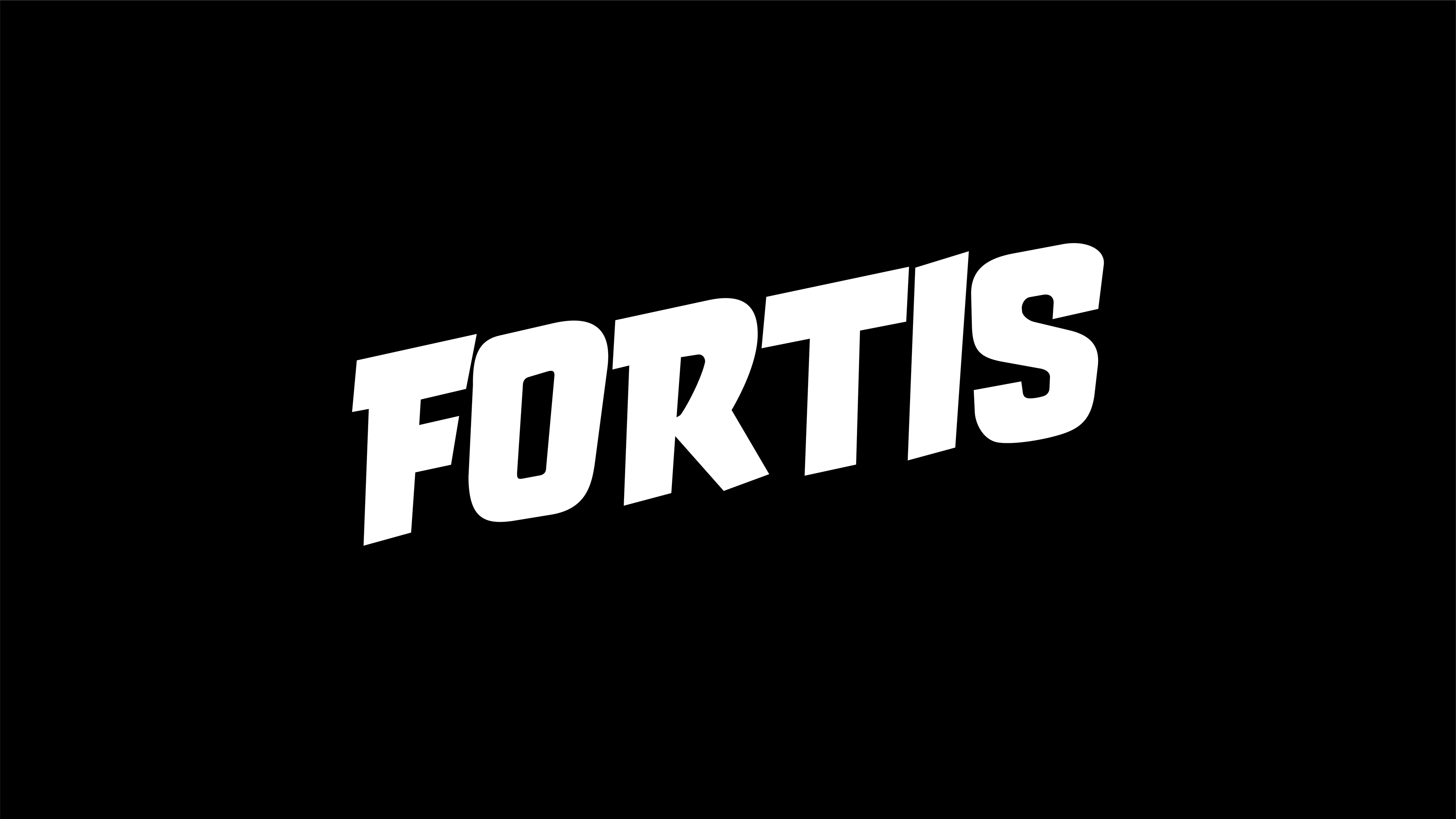


The typeface used is Orgovan Brush, which is a display typeface but still has many elements of a sans serif typeface which is easy to read.
The composition is one that is simple and understandable, since it is packaging it needs to be much easier to digest than a painting is. Having the logo front and center with the rotated halftone patterns, along with the physical information at the bottom achieves this goal.
Brand Guidelines
Research & Process